


International and country-specific top-ranked website palettes for 15 countries
27.09.22
As much as color preference and symbolism are quite constant among groups of people, they also vary from country to country. Because many websites want to target more nationalities, it becomes essential to research appropriate colors for each, at least in order not to choose colors with especially negative connotations. So let's find out what have scientific studies found out about different countries' color preference and the importance of choosing appropriate colors...

How to stay sane and find stock photos that don’t look like stock photos, without going bankrupt
13.09.22
Recently I was looking for some professional fashion stock photos for a commercial project and I was surprised by how long the search took, so I decided to write this guide to help you choose the best stock website in order to find high quality, authentic images, or, in other words, stock photos that don't look like stock photos...
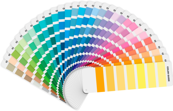
Color in design II: Research-based methods of choosing color palettes
22.08.22
What does research say about the color combinations that people prefer? Is it just a mean of the preference for each of the colors? Is there a relationship between the harmony rating of a pair and its preference? Is the liking directly proportional with the color or lightness contrast? All these questions are answered in this article.

What colors should you choose for your design so that most people like it?
04.08.22
Studies using standardized colors and statistical techniques have clearly settled that, despite large individual differences, group color preferences show consistent patterns as a function of the three primary dimensions of color: hue (basic color), saturation (vividness, purity, or chroma), and lightness (brightness or value)