Color in design II: Research-based methods of choosing color palettes
22.08.22
Andra Voinea
Is In the previous article we have seen which individual colors are preferred and why. Now let us look at color combinations preference.
Palmer [2011] tried to make sense of the seemingly different results in previous studies of color palettes preference by testing the assumption that those were wrongly equating 3 different criteria: 1) pair preference, 2) perceived harmony and 3) figural preference.
So is there indeed a difference between how harmonious we consider a pair of colors and how much we like it? I found this an intriguing question. Let’s see what the team found out.
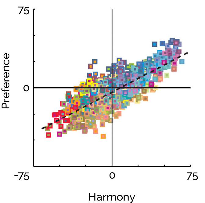
Fig. 1. All the combinations of colors arranged as a function of harmony ratings (x axis) and preference ratings (y axis) – image from Palmer [2011] p. 561
According to the 3 criteria mentioned above, what they found out was:
Pair preference increases with a) hue similarity, b) preference for individual colors and c) a lightness contrast at minimum 30%.
Harmony also increases with hue similarity but is not so dependent on individual colors and prefers a lower lightness contrast (10-30%)
Average figural preferences are highly correlated with preference for the corresponding single figural color against a neutral background (r =0.87) and also with average preference for pairs of colors containing the figural color as figure (r = 0.74). After the influences of these two preference factors were removed, however, preferences for hue contrast and lightness contrast were evident.
Interestingly enough, both preference and harmony increased with hue similarity but preference increased with lightness contrast, whereas pair harmony did not. Harmony also tends to be greater for lighter pairs and for pairs that are more similar in saturation.
Karen B. Schloss & Stephen E. PalmerAesthetic Response to Color Combinations: Preference, Harmony, and Similarity
Liking versus harmony rating
People generally dislike pairs including dark oranges (browns) and dark yellows (olive-colors), even if they are considered harmonious.
Left: Least liked and least harmonious. Right: Disliked despite harmonious
The most liked combinations are also the ones considered most harmonious. We can see harmony has been interpreted as low contrast (in all the respects: hue, lightness, saturation):
Most liked and most harmonious. Differences in lightness are in the range of 10—30%.
However, some pairs that have been rated rather disharmonious were liked above average. They have high lightness contrast and high hue contrast.
Liked despite not harmonious
Conclusion
In conclusion, if you want to appeal to a large audience:
Stay away from the pesky side of brown/dark orange and olive/dark yellow and step in the clear realm of the saturated blues and cyans, with touches of magenta and green.
Choose a similar hue
Dial the lightness contrast to a range of 10-30% difference.
Thank you for reading and I hope you found this summary useful!
Bibliography
Palmer, S. E., & Schloss, K. B. (2011). Aesthetic response to color combinations: preference, harmony, and similarity. Attention, Perception, & Psychophysics, 73(2), 551-571.
Palmer, S. E., & Schloss, K. B. (2010). An ecological valence theory of human color preference. Proceedings of the National Academy of Sciences, 107(19), 8877-8882.
Terwogt, M. M., & Hoeksma, J. B. (1995). Colors and emotions: Preferences and combinations. The Journal of general psychology, 122(1), 5-17.
Share This Article
RELATED ARTICLES
It’s dark/It’s light? Readability does depend on color
17.10.22
What text and background colors are best for legibility and reducing eye strain? What do users tend to prefer?
International and country-specific top-ranked website palettes for 15 countries
27.09.22
As much as color preference and symbolism are quite constant among groups of people, they also vary from country to country. Because many websites want to target more nationalities, it becomes essential to research appropriate colors for each, at least in order not to choose colors with especially negative connotations. So let's find out what have scientific studies found out about different countries' color preference and the importance of choosing appropriate colors...