
The article “Cultural interface design: Global colors study”[Kondratova 2006] summarizes the main findings related to the importance of culturally appropriate design:
- There is a need for culturally appropriate interface design for Web-based e-business and e-government applications. This was shown by many researchers. Specifically, it is noted that the “culturability”, a combination of culture and usability in Web design, directly impacts on the user’s perception of credibility and trustworthiness of websites;
- A culturally sensitive e-commerce framework developed by Sudweeks and Simoff lists cultural appeal as one of the four important factors impacting on sustainability of e-commerce activity, along with economic appeal, usability and general attitude towards e-commerce; thus reflecting the importance of cultural factors in e-commerce applications;
- There is a growing body of evidence that supports the importance of culturally appropriate design for e-learning applications.
As color clearly plays a big role in “culturable” design, the authors set out to analyze the top-ranked websites in 15 countries: Australia, Brazil, Canada (French and English), China, Finland, France, Germany, India, Italy, Japan, Russia, Saudi Arabia, Spain, United Kingdom, and United States of America. For each country, around 1000 domain names were analyzed. The search was restricted to pages written in the country languages. Photos were excluded in order to focus on interface.
The most popular 16 colors used in each country were compared and the results were quite surprising: 10 colors are commonly and preferentially used across all countries studied: white, black, all 3 shades of gray, all 3 shades of blue and light yellow. This color palette was named the “international color palette” (Figure 1). The group of the rest of 6 colors for each country was called “country specific color palette” (also Figure 1)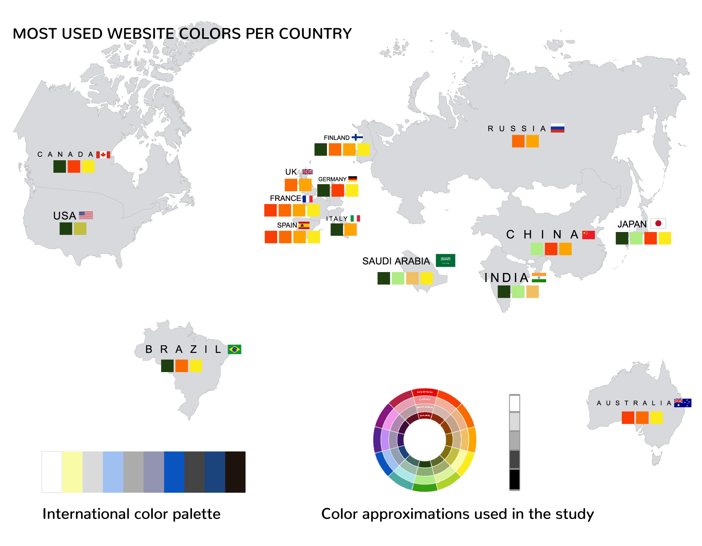
The fact that even China, which has a traditional negative connotation for white, had this color in its’ top 10, shows how fast can long-lasting associations change.
Conclusion
The international palette is useful when designing for a multitude of cultures. When localization is required, country-specific colors can be added in order to be more liked by the audience and more culturally appropriate. [Kondratova 2006].
Bibliography
- Kondratova, I., & Goldfarb, I. (2006, October). Cultural interface design: Global colors study. In OTM Confederated International Conferences” On the Move to Meaningful Internet Systems” (pp. 926-934). Springer, Berlin, Heidelberg.
- Kondratova, I., & Goldfarb, I. (2007, July). Color your website: use of colors on the web. In International conference on usability and internationalization (pp. 123-132). Springer, Berlin, Heidelberg.