1. Legibility
Legibility can be tested by the number of mistakes in recognizing text. We will look first at studies for print and then for LCD screens.
1.1. Print: positive polarity
The legibility of printed materials has been thoroughly researched: dark text on a light background (positive polarity) is more readable than the opposite (negative polarity). Previous research also shows that a slightly colored paper does not affect text readability, but the brightness contrast between the foreground and background colors do affect it; the greater the contrast, the better the readability. [Tinker 1966]
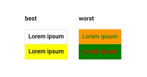
Beside the general guidelines, previous research has given specific color combinations that are now considered optimal for readability enhancement (black text on white background and black text on yellow background) and some which are not recommended for use (as shown in Fig. 1, green text on an orange background and red text on a green background). [Tinker 1966]
1.2. LCD: both legibility and user preference are high on positive polarity
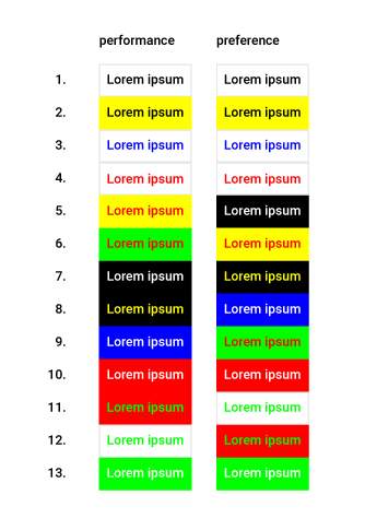
Fig 2. The highest ranked text-background color combinations are contrastive schemes with positive polarity (dark on light) [Humar 2014]
For LCD screens, a study [Humar 2014] done on 308 participants and involving 56 color pairs finds that the best combinations for both legibility and personal preference are contrastive colors, with darker text on lighter backgrounds.
What is interesting is to see the quite low ranking of white text on black background. Subjects showed a higher preference for the light mode (i.e., presenting dark texts on a light background), which may be related to their usage habits [Xie 2021].
2. Fatigue strikes: on low light, the dark mode comes to the rescue
According to Xie [2021], when light is dim, the dark mode is more conducive to reducing visual fatigue. High luminance contrast ratios help reduce visual fatigue and people also prefer higher luminance contrast.
3. Conclusion
Luminosity contrast is important to reduce visual fatigue. For print, dark text on light background (positive polarity) is the best for legibility. The same goes for LCD. Furthermore, people also like positive polarity more. However, when the main purpose is reducing visual fatigue at night, negative polarity has better results.
Bibliography
- Humar, Iztok, et al. “The impact of color combinations on the legibility of text presented on LCDs.” Applied ergonomics 45.6 (2014): 1510-1517.
- Tinker, Miles A. “Experimental studies on the legibility of print: an annotated bibliography.” Reading Research Quarterly (1966): 67-118.
- Xie, Xiaojiao, et al. “Study on the effects of display color mode and luminance contrast on visual fatigue.” IEEE Access 9 (2021): 35915-35923.
- Zorko, Anja, et al. “The impact of the text and background color on the screen reading experience.” Tehnički glasnik 11.3 (2017): 78-82.