About TNR
Times News Roman is Romanian online newspaper that has a unique way of presenting news or opinions in a comical manner based on satire. It focuses mainly on Romanian news and local celebrities, but it’s distinctive brand of humor also tackles international news from time to time.
TNR has also a beverage companion to the online newspaper, a high-quality craft beer called Berea TNR. Both share the same branding and distinctive graphical style.
The challenge
- Creating a website that represents a distinctive comical/satire graphical tone
- From a technical point of view, a part of the website is reserved for Premium clients, so that needed to be taken into consideration when creating the content and development structure
- Being a content rich project, TNR neede a powerful CMS (Content Management System) solution to facilitate the rapid flux of information coming to the website
UI/UX Design & Development
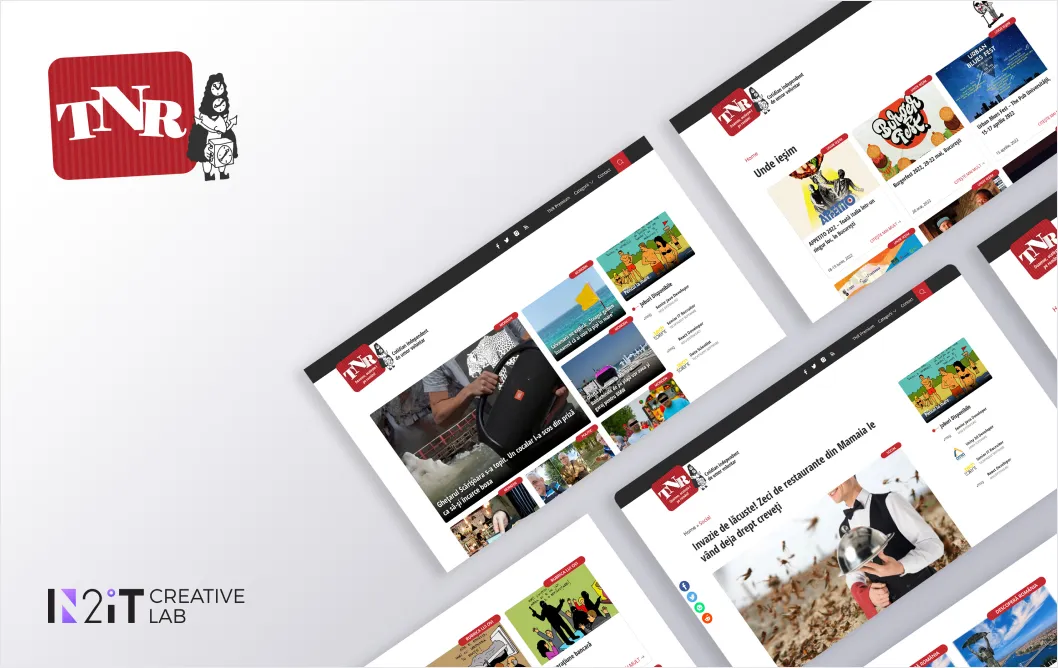
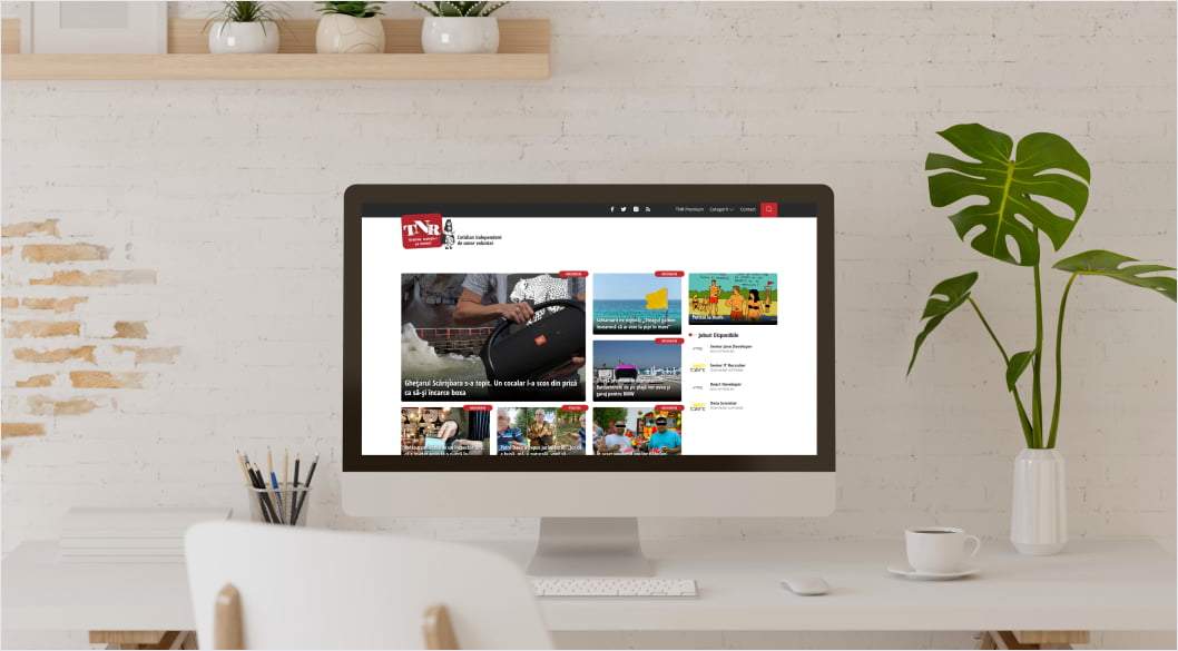
Despite TNR being a client that doesn’t take itself too seriously, the team behind Times New Roman were very serious about having a website that reflected the company’s unique personality. So we designed their website keeping that in mind.

Since it features a lot of content rapidly changing, our team concluded that the best way to address this challenge is to equip TNR with the capacities of a CMS with custom integrations that would facilitate this constant changing of information.
The design thinking for this project started with this premise in mind, so all the categories and articles were created in a grid designed specifically to suit an online magazine or newspaper. The timeline was of course also important and a crucial factor, so all the information/content was structured in a chronological manner that had been an integral part of constructing the visual hierarchy for the TNR website.
Branding
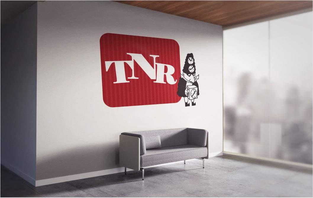
Times New Roman’s unique personality is of course reflected in the stunning visuals that were created as part of its branding. Its logo is memorable and comical, easy to recognize and fits perfectly with the overall design of the website and beer companion. It’s playful and satirical in nature, but at the same time it cohesive in voice and tone from a design standpoint.

The Outcome
Times New Roman is a funny online newspaper, so it is no surprise that it was a fun project to be working on, since it’s powerful branding strategy made it so easily recognizable, as much as the TNR content itself. The client was happy with the product and both the Free and Premium sections made have reported growing conversion rates and user activity.
